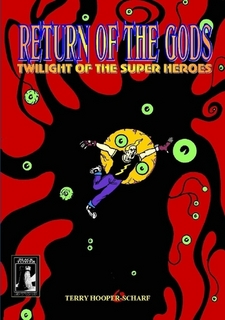
With each book I publish (and there are 180 of them) I go through at least 4-6 cover designs. The covers are, after all, the first thing potential buyers see. The original Return of the Gods: Twilight of the Super Heroes cover collecting the original six part series from Black Tower Adventure was pretty basic with Jack Flash on the cover...
Oddly enough this design was praised by reviewers so it just goes to show my modest genius at work (did you just laugh??!)
There was the same problem when it came to The Green Skies. Spo much goes on in the story that picking a scene and putting it on the cover would not work. I tried various designs and rejected many (I believe I had twenty different cover designs -some I later used as promo images).
This one of the Many-Eyed One manifesting itself I thought "Cool" then looked again. I then asked myself; "Is this amateur hour?" and it was thrown out.
I didn't even (consciously) realise that there were 'eyes' in the pattern so...SCORE!
For what Jack Flash was going through the background colour seemed to fit but then it came to the next cover featuring the Druid in silhouette. I tried to use the same colour background but it did not work. It worked for Jack Flash but the Druid was a very hippy-trippy guy and...eccentric.
I had various tie-tied patterns and none worked so I got outthe Spirograph...no matter what I tried it was not clicking but I then found an image on an old disc quite by accident. I have no idea where it came from but it looked okay but the colours did not work. So I played around with colour saturation and filters to the point that it became a different colour to the original altogether.
It worked. Breakdown cancelled. And believe me, I was about to throw the whole new cover design out.
Background fot the third volume was being a pain and as it happens I had to read up on something pertaining to foxes and as I put a note in the back of the book I realised that the colour end paper looked...lovely. I scanned it then toyed about with colour and contrast then saturation and....Varik Dann (or is he? Best not to ask him) had his background.
Now, having gone through all of this (don't panic about wasted paper as the back of rejected art gets used for print outs or note taking) I was still going from foot to foot with "Does it look right? Will it work? Can I trust my own covers?" At one point I thought "No!" and looked at other possible designs. Nothing worked because the battling super heroes covers just did not fit.
In the end I finished the book editing and took another long look at the covers and...decided to go with them. Why I put myself through this I have no idea 😅😅😅 but I do.
From Return of the Gods to The Cross Earths Caper and finally The Green Skies the covers seem to have a natural progression.
What started as "Invasion Earth 1987" has finally been completed in...2021. Around a thousand pages over five books and a nervous breakdown all the way! "The UKs First super hero epic!" someone wrote and I think that over simplifies the story which has so many twists and turns and not one written script anywhere -and all of the notes for "What will happen" were ignored and that flexibility allows the twists and turns and being Independent means I edit and decide what goes into each book and there are no constraints put on me by a publisher.
So, that's how I chose the covers.
The Invasion Earth Trilogy Store links.
A4
B&W
126pp
£10.00
The Green Skies vol. III
A4
B&W
208pp
£10.00


No comments:
Post a Comment